
Building a brand identity + designing packaging for a blister care product
RUB-EEZ
-
Create a blister care brand that fills a market gap for active individuals looking for something practical & portable.
-
I started this project by playing with names that felt light and clever. I pulled together “rub” & “ease” and landed on Rub-eez, a name that sounds simple, friendly, to the point (and a little catchy)
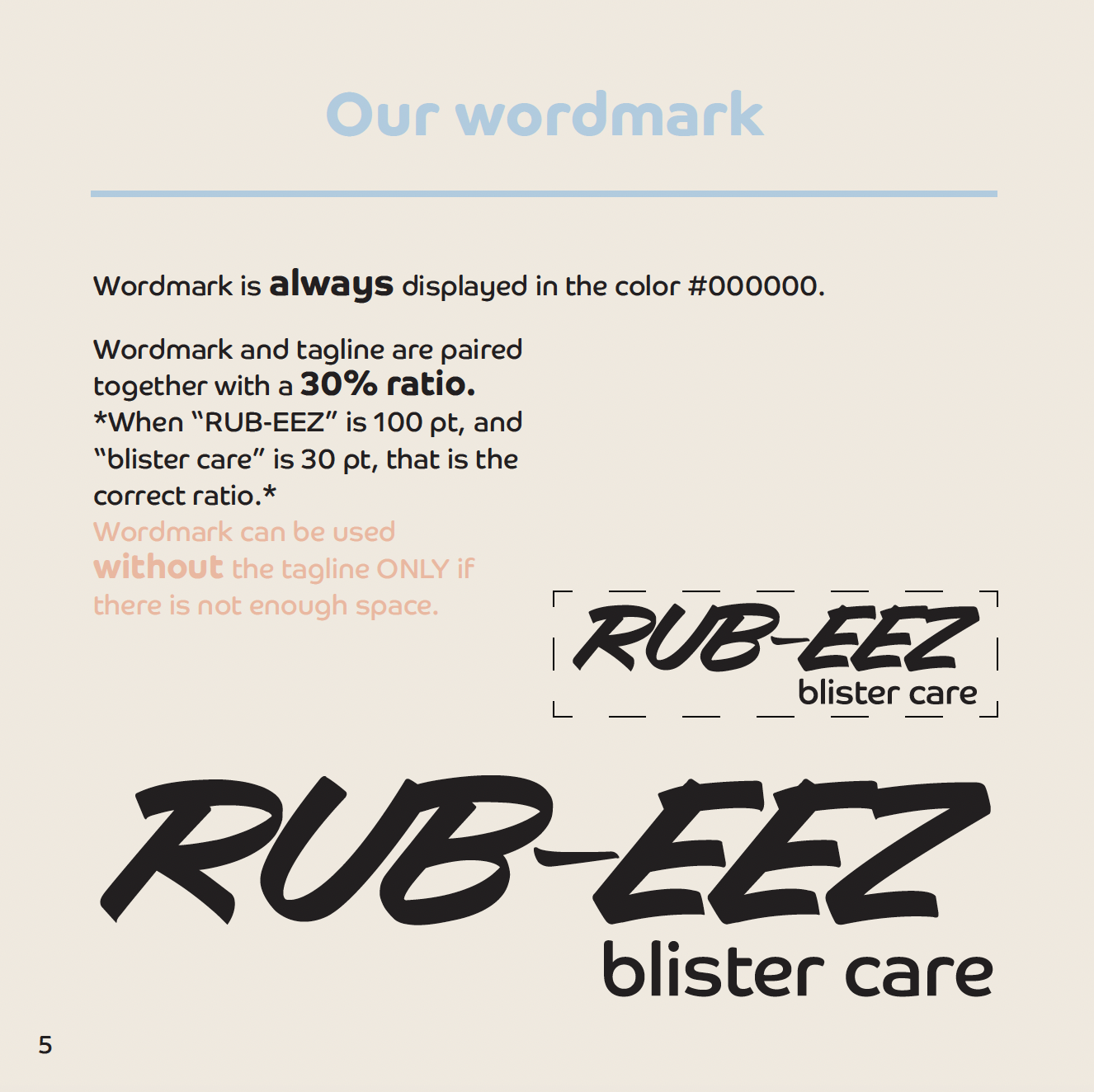
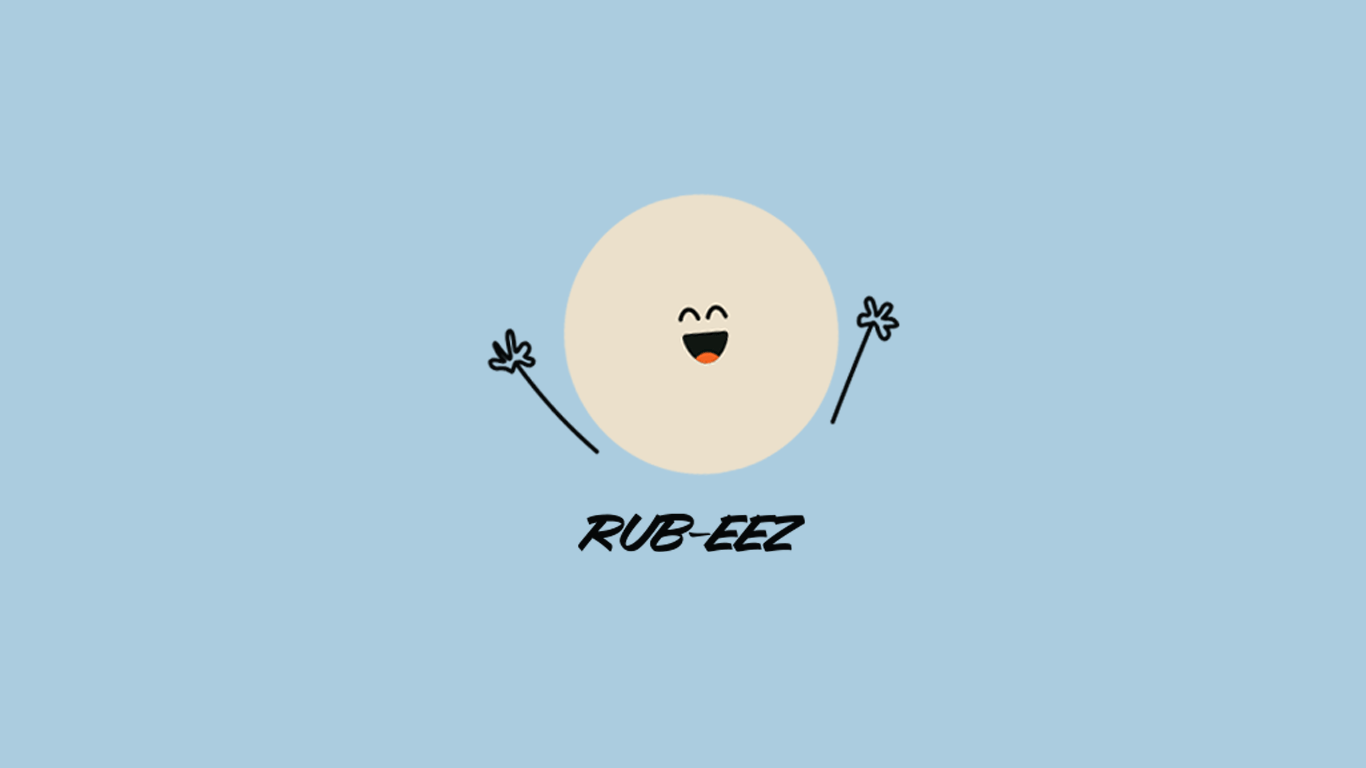
From there, I built a wordmark using Avalanche, a typeface with a lot of movement and energy. I then explored some logo ideas and a brand character which led me to drawing a abstract blister shape with a bit of personality. A lot of competitors looked very clinical, which can feel cold when you just want relief, so I leaned into warmth and ease instead of more pain.
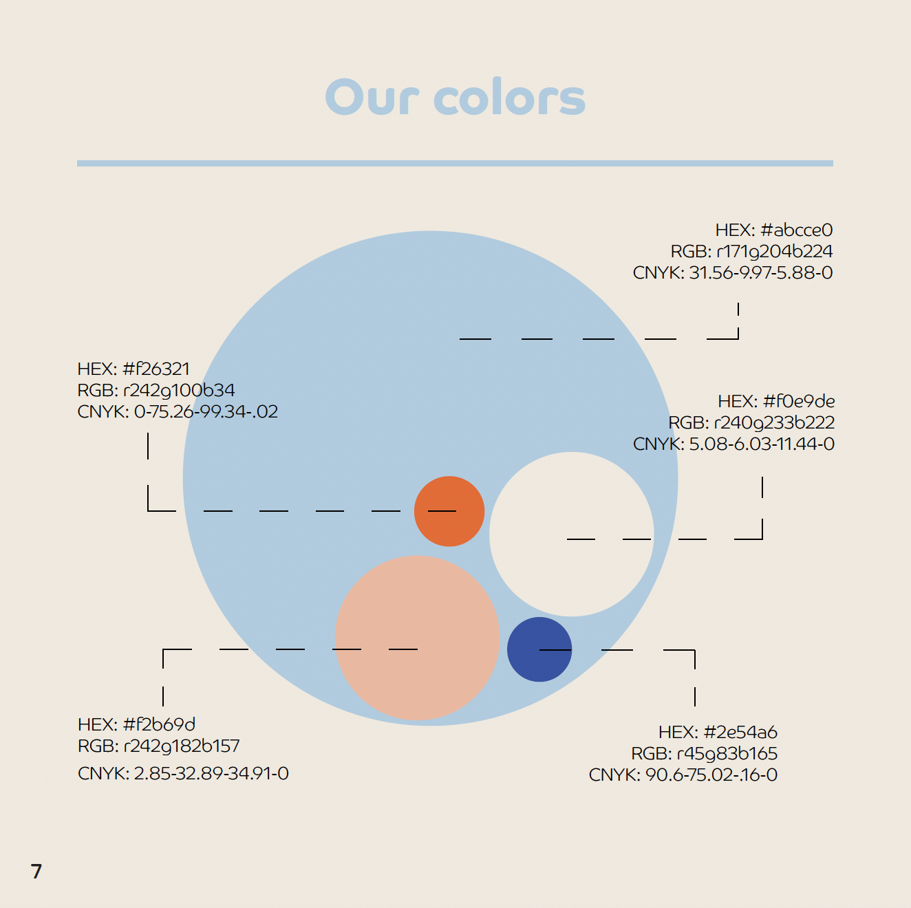
This way, the abstract blister mark helps soften the topic and makes the problem feel more approachable. I paired it with muted calming colors. Together with the name, the identity is meant to communicate relief and ease across every touchpoint, from packaging to marketing.
-
Illustrator, Photoshop, InDesign