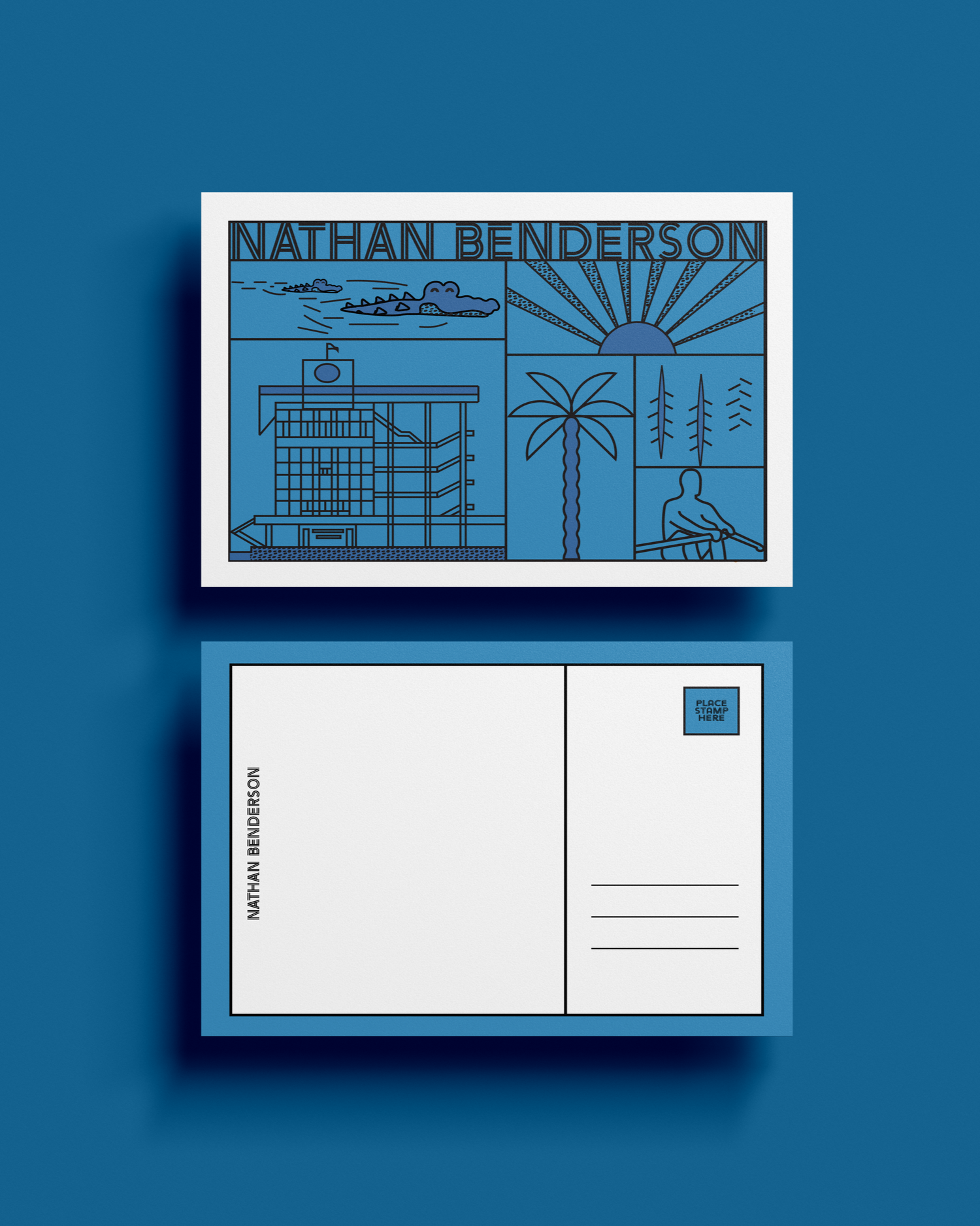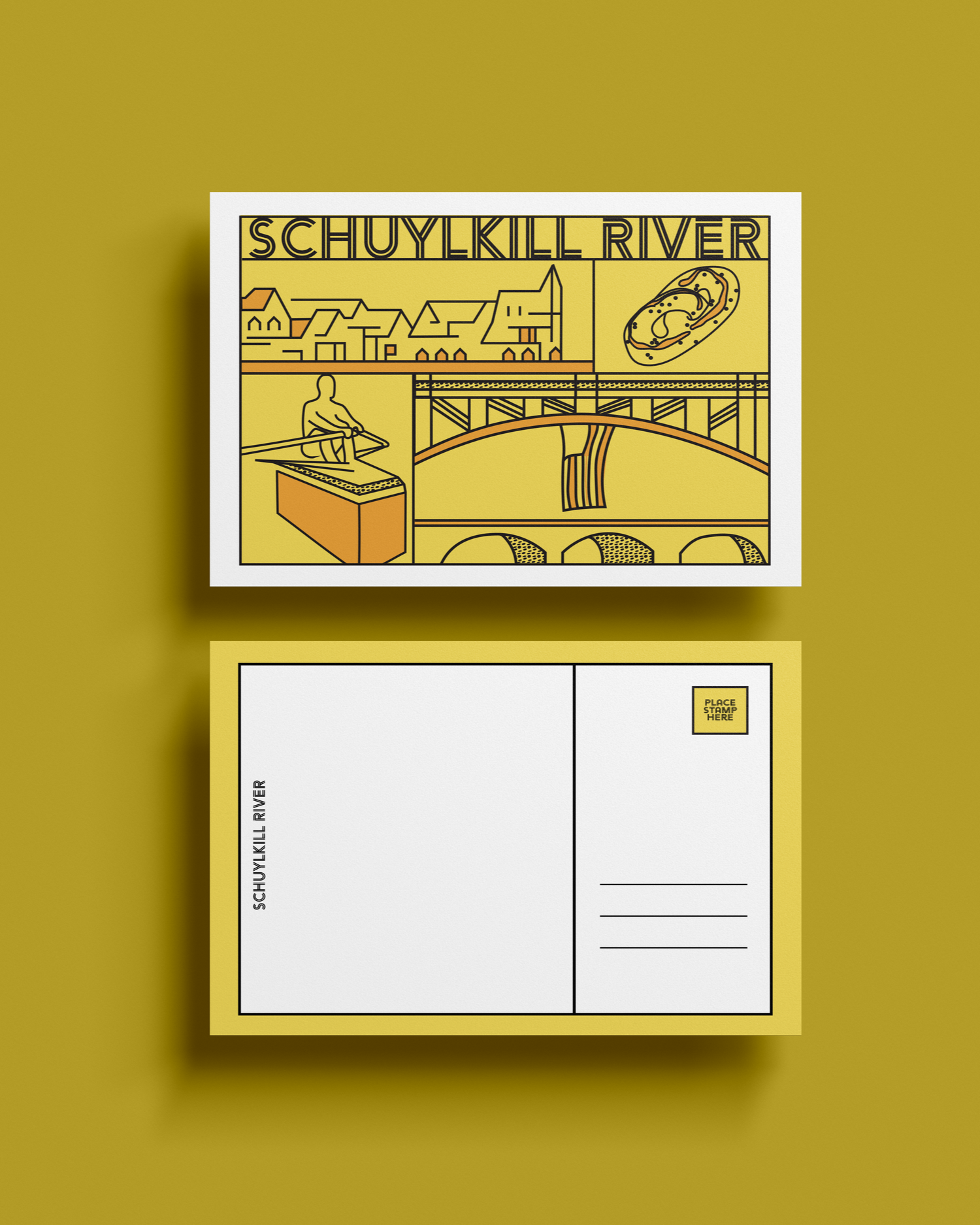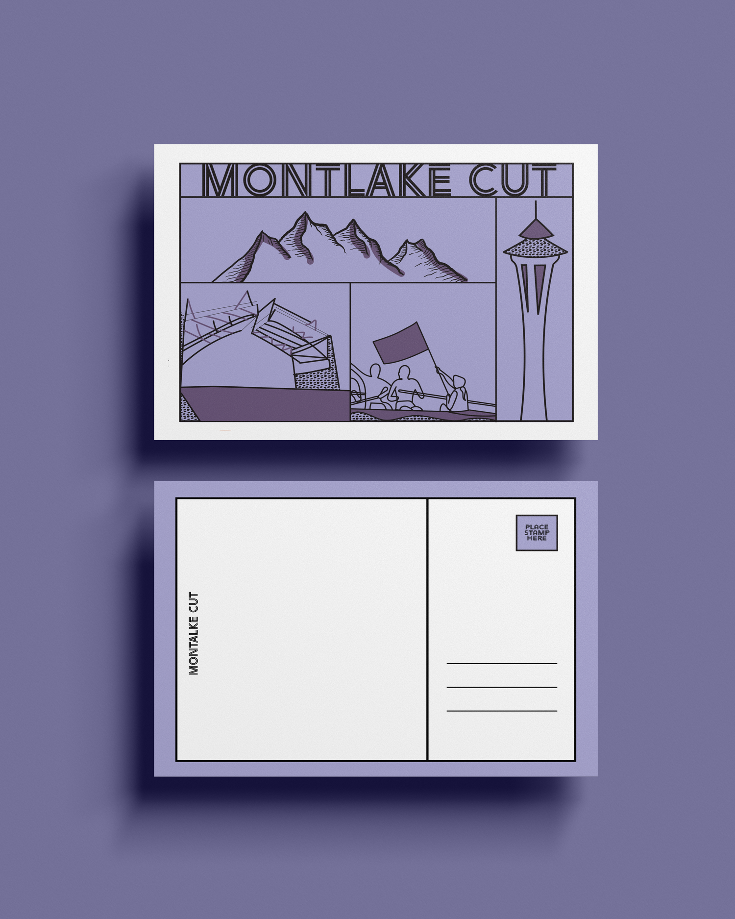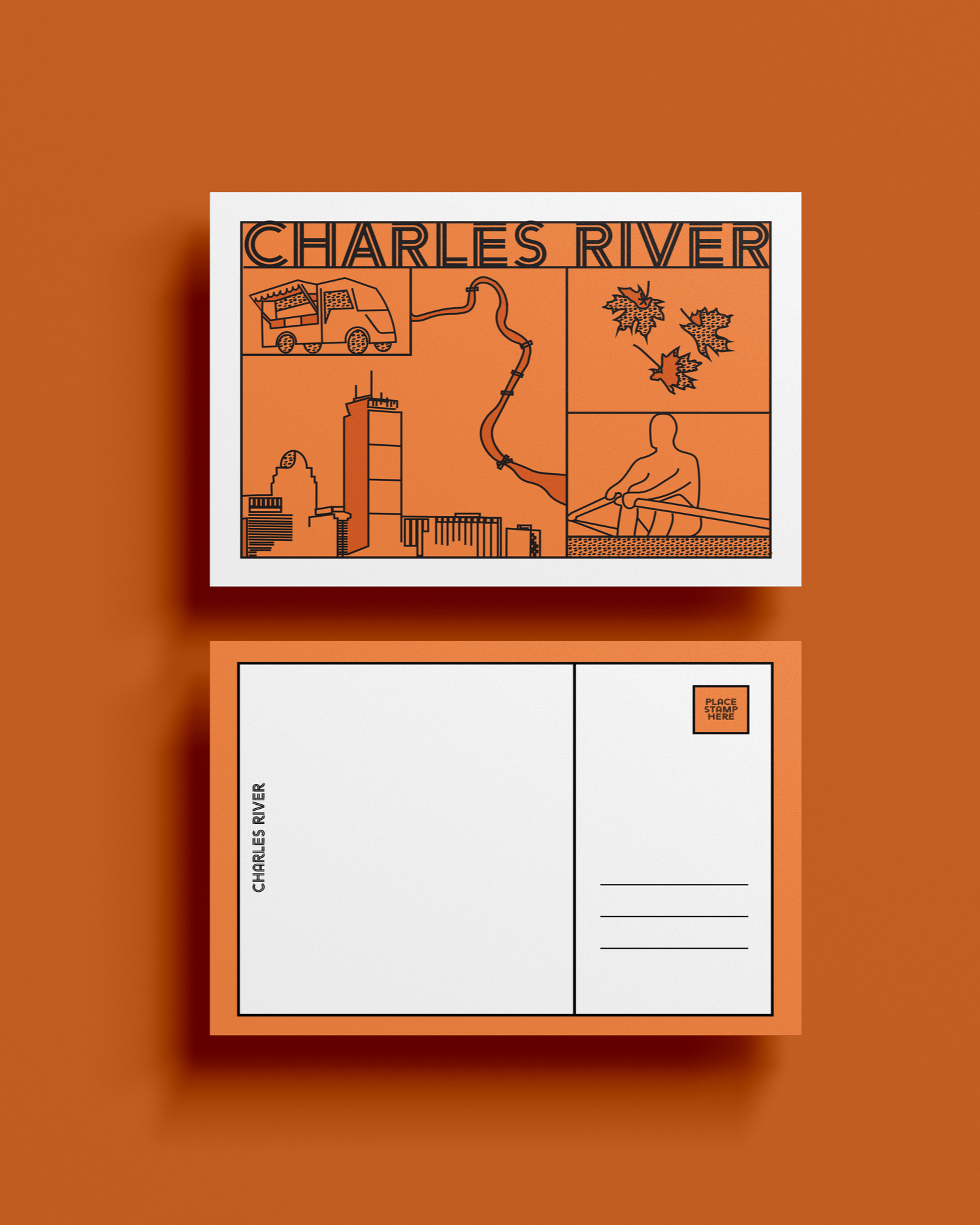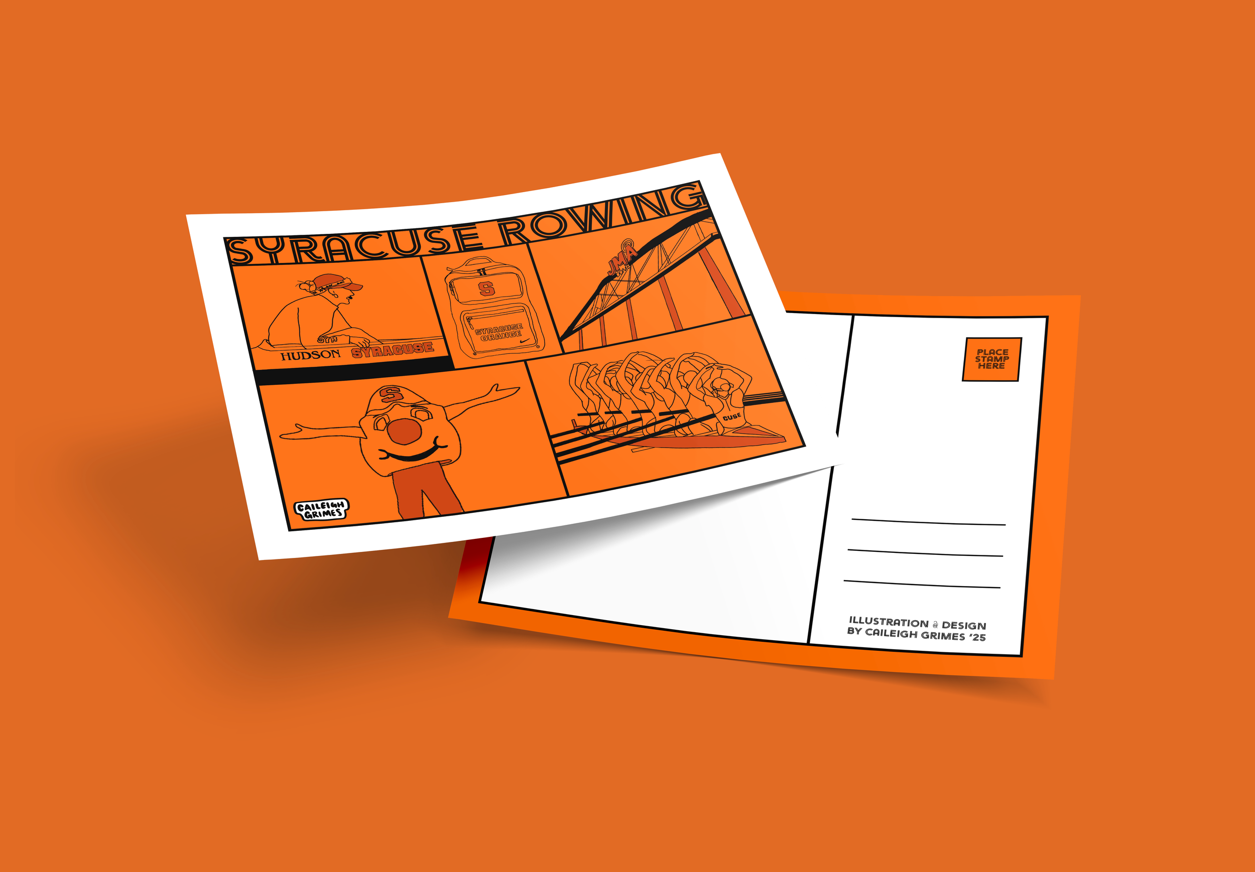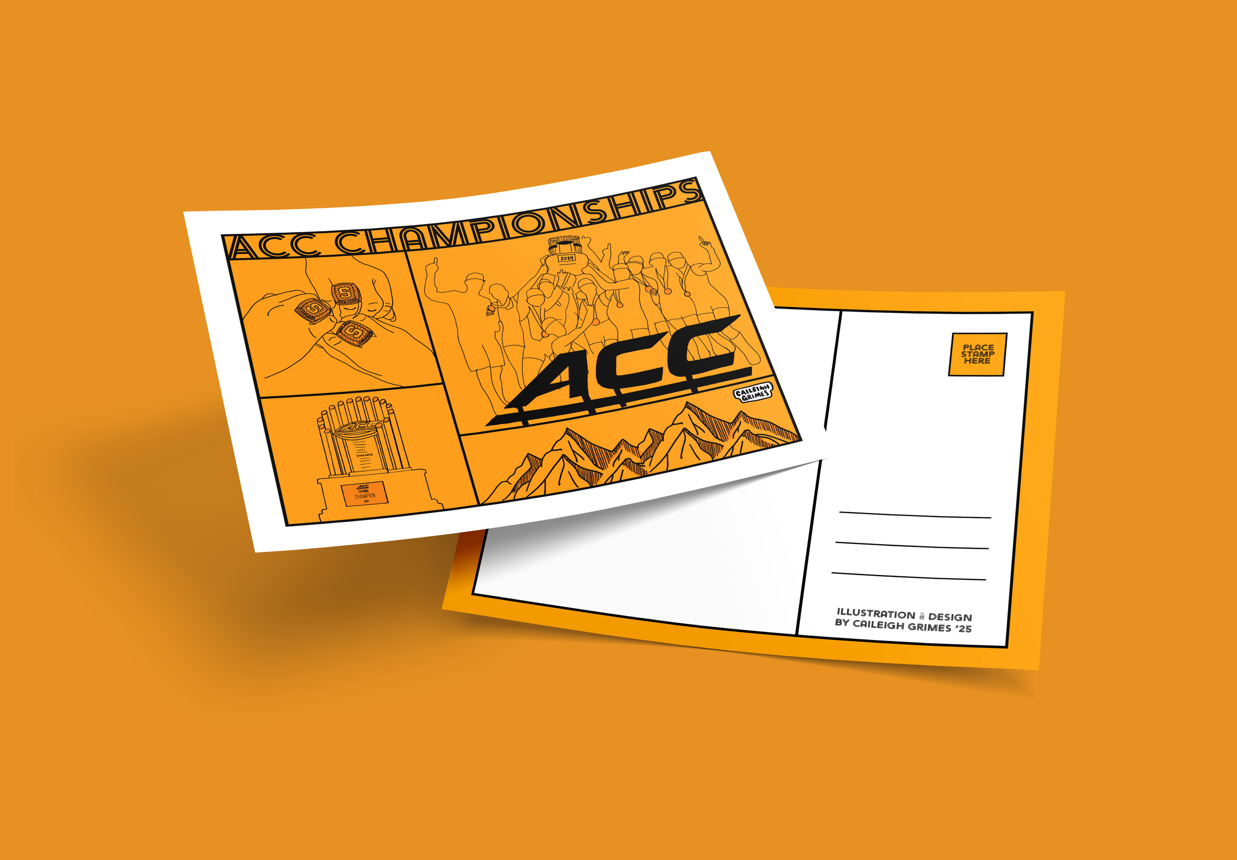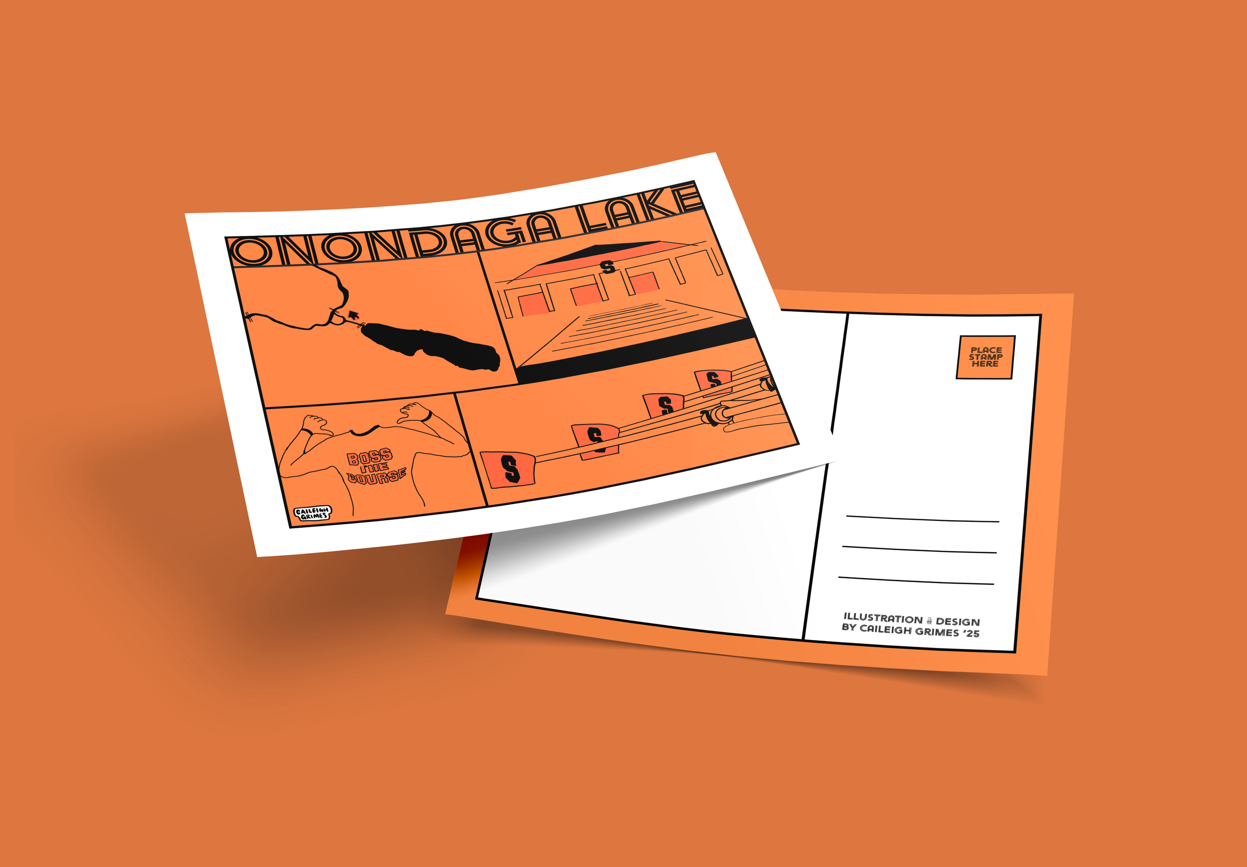

Illustrating a postcard series inspired by my favorite regatta locations
-
Create an illustrated postcard series that celebrates the unique spirit and sensory experience of regatta culture through playful, location-driven design.
-
Drawing inspiration from memorable rowing events, this series captures the nostalgia and camaraderie that define regatta days. Each postcard integrates a coloring-book–style grid that evokes both structure and spontaneity, highlighting distinctive details—from race courses and local food to the sounds and energy of spectators. The visual system combines illustration and layout to evoke joy, familiarity, and movement, inviting viewers to relive these moments through sight, texture, and tone.
-
Illustrator, Photoshop, Procreate